Portal
Renders its children above the rest of the window, outside the parent's clipping.

Import
import { Portal } from "@tarve/core";Usage
import { Badge, Portal, Text, View, theme } from "@tarve/core";

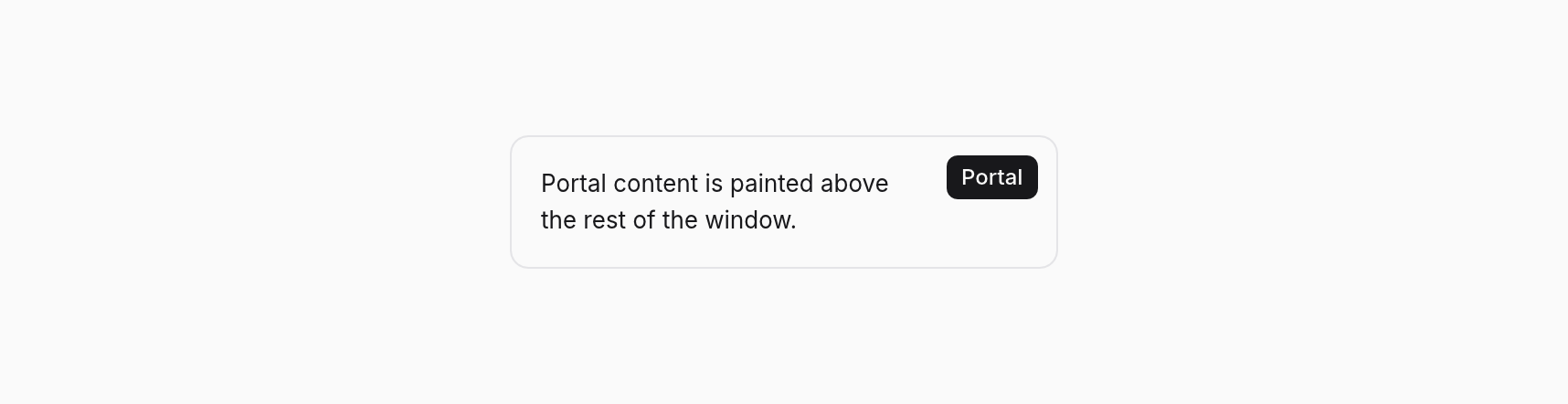
<View style={{ position: "relative", width: 300, padding: { top: 16, right: 72, bottom: 16, left: 16 }, radius: 10, borderWidth: 1, borderColor: theme.colors.border }}>
  <Text size={13}>Portal content is painted above the rest of the window.</Text>
  <Portal style={{ position: "absolute", top: 10, right: 10 }}>
    <Badge>Portal</Badge>
  </Portal>
</View>
Props
Portal has no props of its own beyond the inherited and common props below.
Inherited from ViewProps 14 props
| Prop | Type | Default |
|---|---|---|
align | Style["align"] | — |
autoFocus Focus this control when it first appears (HTML `autofocus`); interactive views only (Pressable). | boolean | — |
children | BindableChild | — |
dismissOnOutside A press outside the box fires `onOutsideClick` instead of reaching what is under it (light dismiss). Works on portals and in-flow boxes; an open portal wins. | boolean | — |
dragRegion | boolean | — |
flex CSS `flex`: `1` is `1 1 0`; strings take any CSS value, e.g. `"1 1 176px"`. | number | string | — |
focusable | boolean | — |
gap | number | — |
justify | Style["justify"] | — |
onOutsideClick With `dismissOnOutside`: a press (or right click) outside the box. | () => void | — |
padding | Style["padding"] | — |
portal | boolean | — |
style Values may be signals: setting one restyles this box without a render. | Reactive<Style> | — |
windowAction | "minimize" | "toggleMaximize" | "toggleFullscreen" | "close" | — |
Common props
Shared by every component. See descriptions →
classclassNamedropTargetfileDropTargethighlightidkeymotionFromonDragEnteronDragLeaveonDroponFileDragEnteronFileDragLeaveonFileDroponHighlightonPasteonPointerLeaveonPointerMoveonSizeonTransitionEndrovingGroupTypes
type BindableChild = Child | Signal<unknown> | BindableChild[];type Reactive<S> = { [K in keyof S]: S[K] | Signal<Exclude<S[K], undefined>> };