AppMenuBar
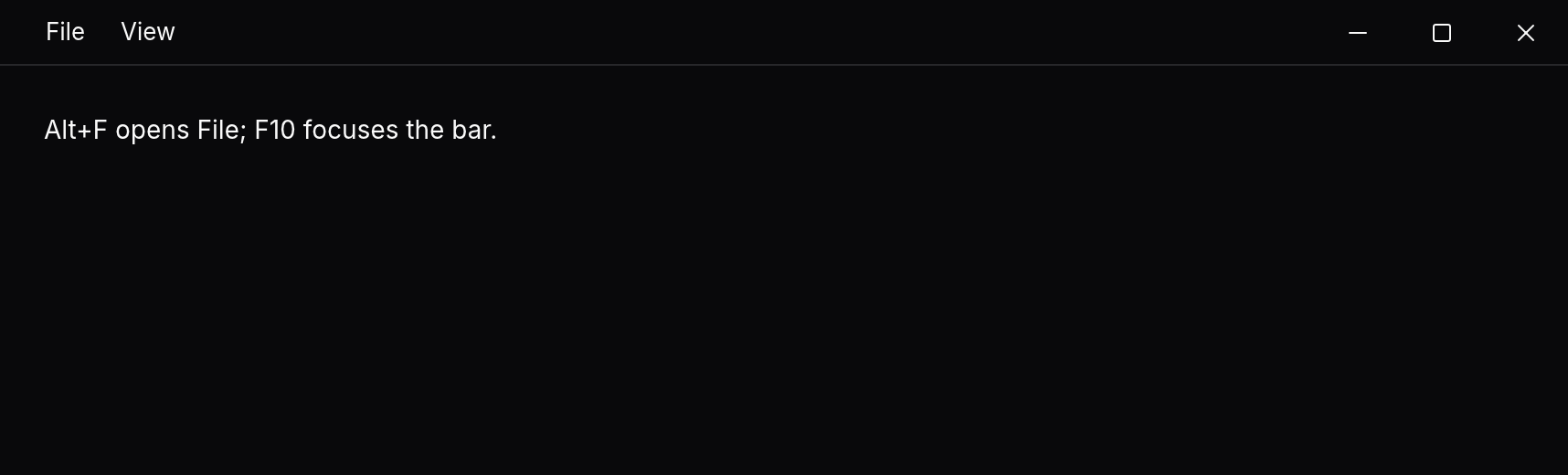
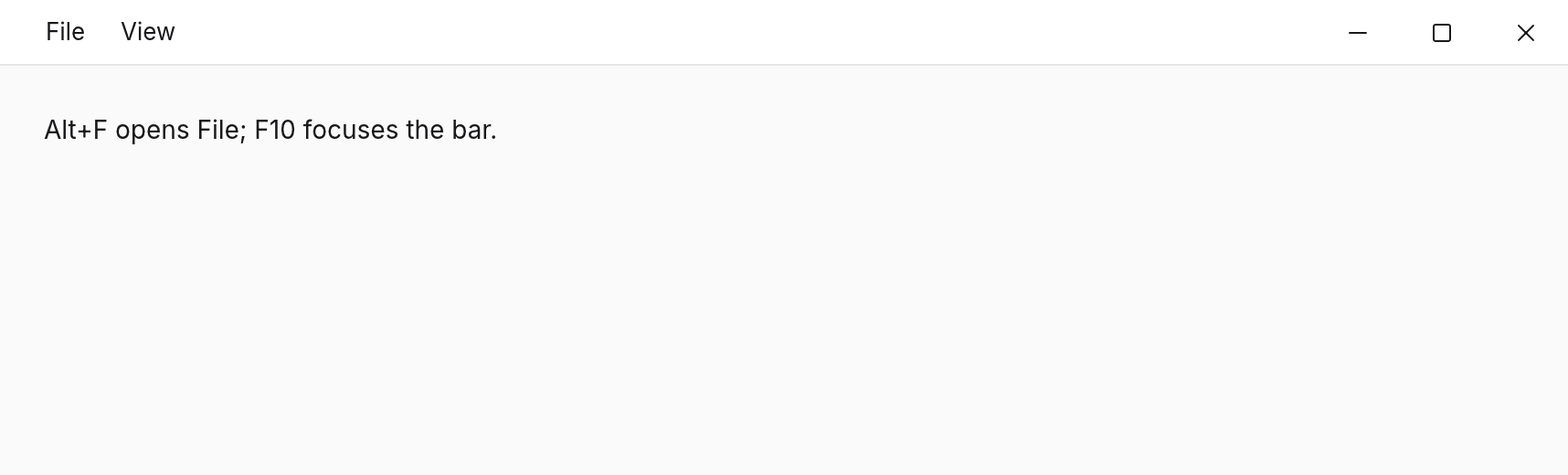
The window's application menu bar, with access keys, accelerators and submenus; what app.menuBar draws.
A menu bar drawn by the app, in the theme: the same on every system, in a framed or frameless window, or inside a `TitleBar`. Arrow keys move along the bar and through a menu, Enter/Space choose, Escape closes; menus open on click and follow the pointer while one is open, like a system menu bar. `app.menuBar(items)` places one at the top of the window (after a `TitleBar`) and adds Alt access keys, F10 and accelerators.
Import
import { AppMenuBar } from "@tarve/core";Usage
import { AppMenuBar, Column, Text, TitleBar, Window, darkTheme } from "@tarve/core";

<Window title="Notes" width={640} height={260} theme={darkTheme}>
  <TitleBar height={36}>
    <AppMenuBar
      items={[
        {
          label: "&File",
          items: [
            { id: "new", label: "New", accelerator: "Ctrl+N" },
            { id: "open", label: "Open…", accelerator: "Ctrl+O" },
            { type: "separator" },
            { label: "Recent", items: [{ id: "recent-1", label: "notes.md" }] },
          ],
        },
        { label: "&View", items: [{ id: "wrap", label: "Word wrap", checked: true }] },
      ]}
      onSelect={(id) => console.log("menu", id)}
    />
  </TitleBar>
  <Column flex={1} padding={24}>
    <Text>Alt+F opens File; F10 focuses the bar.</Text>
  </Column>
</Window>
Props
| Prop | Type | Default |
|---|---|---|
items required | readonly MenuBarItem[] | — |
onSelect After an item's own `onSelect`, with its id (`menu-<n>` when it has none). | (id: string) => void | — |
Common props
Shared by every component. See descriptions →
childrenclassclassNamehighlightidkeymotionFromonHighlightonPasteonPointerLeaveonPointerMoveonSizeonTransitionEndrovingGroupstyleTypes
type MenuBarItem =
  | { type: "separator" }
  | { type?: "item"; id?: string; label: string; accelerator?: string; checked?: boolean; disabled?: boolean; onSelect?: () => void; items?: MenuBarItem[] };