Dialog
Alias of Modal, named after the shadcn convention.
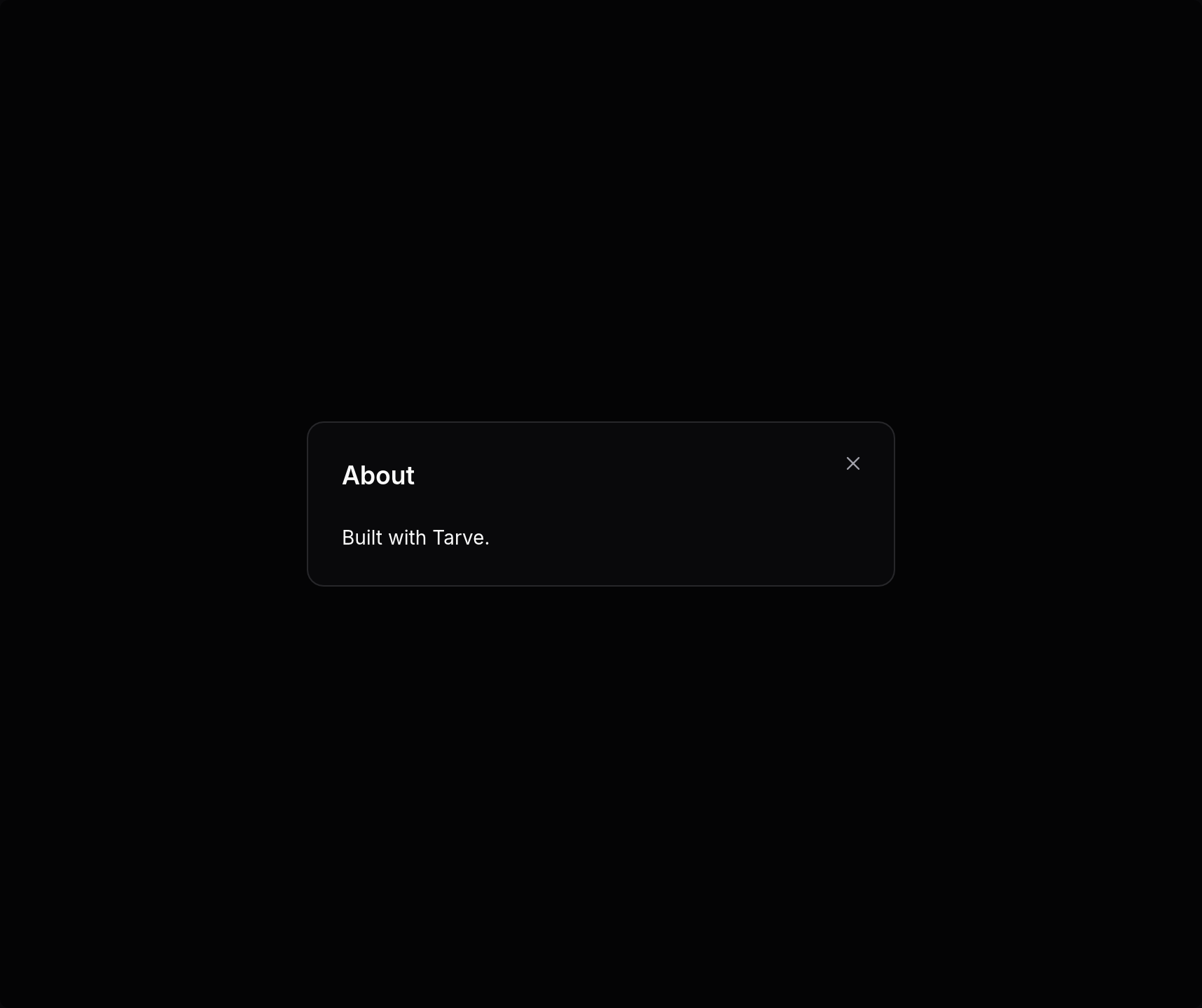
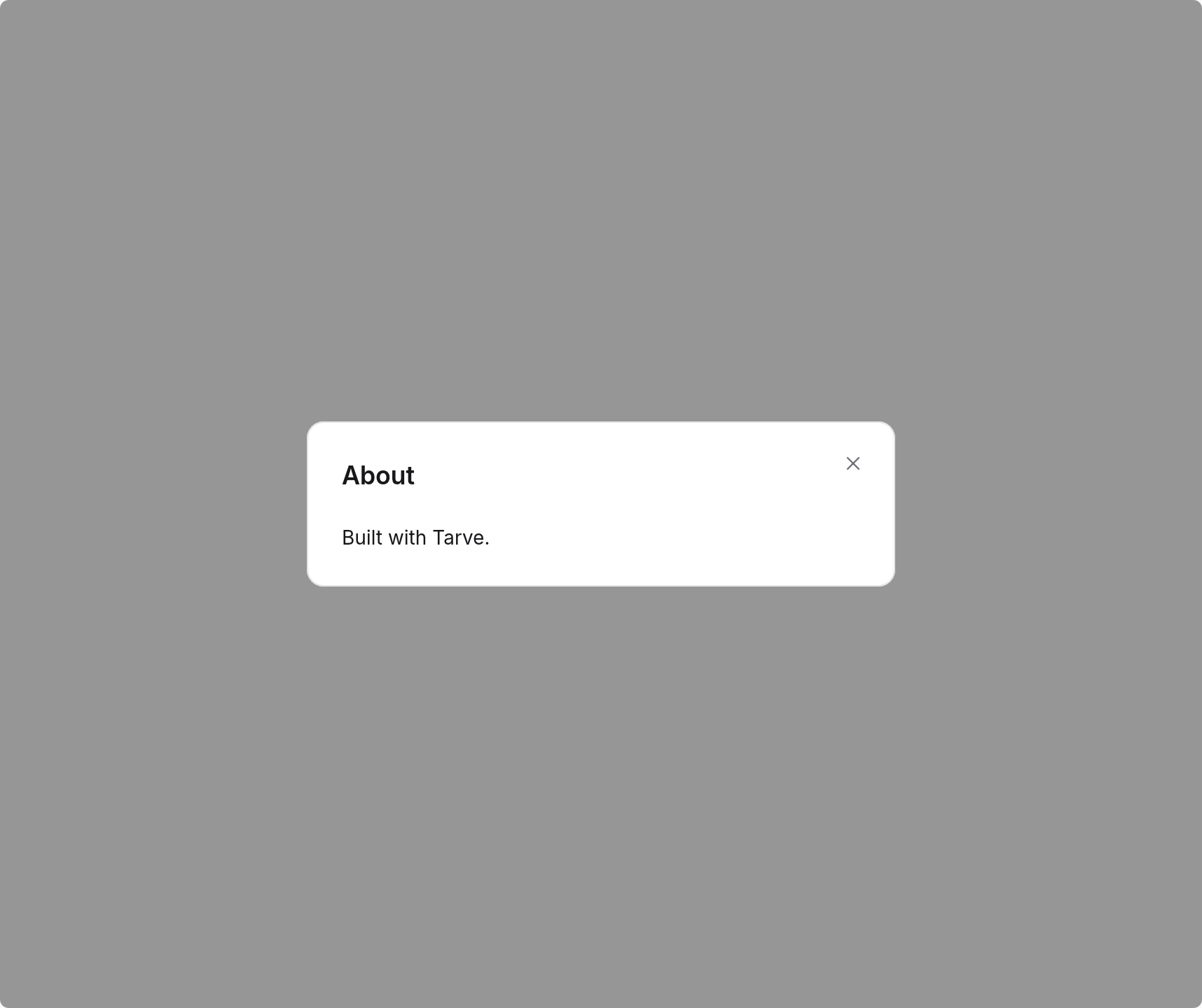
Import
import { Dialog } from "@tarve/core";Usage
import { Button, Dialog, Text } from "@tarve/core";

let open = true;

<>
  <Button variant="outline" onClick={() => (open = true)}>
    About
  </Button>
  <Dialog
    open={open}
    title="About"
    width={420}
    onOpenChange={(next) => {
      open = next;
    }}
  >
    <Text>Built with Tarve.</Text>
  </Dialog>
</>
Props
Dialog has no props of its own beyond the inherited and common props below.
Inherited from ModalProps 10 props
| Prop | Type | Default |
|---|---|---|
open required | boolean | — |
closeOnEscape | boolean | — |
closeOnOverlay | boolean | — |
description | string | — |
footer | Child | — |
onOpenChange | (open: boolean) => void | — |
scrollBody The panel never grows past the window (24 px margins): title and footer stay put and the body scrolls (a `Scroll`). Default `true`; `false` lays the body out unbounded, as before. | boolean | — |
showClose | boolean | — |
title | string | — |
width | number | — |
Common props
Shared by every component. See descriptions →
childrenclassclassNamehighlightidkeymotionFromonHighlightonPasteonPointerLeaveonPointerMoveonSizeonTransitionEndrovingGroupstyle