Glass
Liquid Glass: a refracting, blurring surface for toolbars, tab bars and floating controls.
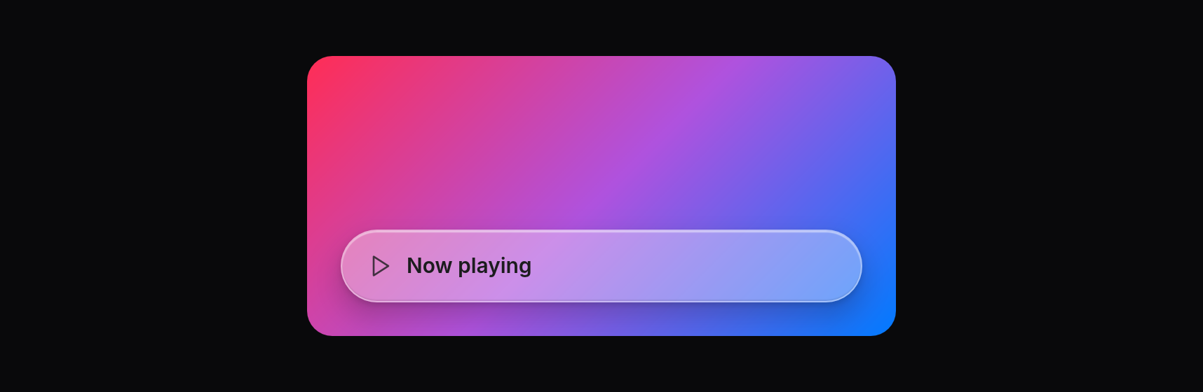
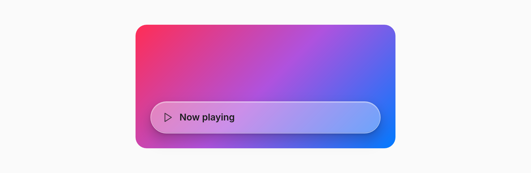
A container made of Liquid Glass: what scrolls behind it shows through blurred, bent at the rounded edge, under a light veil, with a bright rim. Compose like a `View`; controls inside keep their own look.
Import
import { Glass } from "@tarve/core";Usage
import { Glass, Icon, Text, View } from "@tarve/core";

<View style={{ width: 420, height: 200, radius: 18, padding: 24, justify: "end", background: "linear-gradient(135deg, #ff2d55, #af52de 50%, #007aff)" }}>
  <Glass radius={26} style={{ height: 52, padding: { left: 18, right: 18 }, direction: "row", align: "center", gap: 10 }}>
    <Icon name="play" size={18} color="#1c1c1ecc" />
    <Text size={15} weight={600} color="#1c1c1e">Now playing</Text>
  </Glass>
</View>
Props
| Prop | Type | Default |
|---|---|---|
appearance Light or dark appearance of the rim and veil. Default `light`. | "light" | "dark" | "light" |
blend How far apart in px two merged boxes start bridging; read from the first box of the key. Default 32. | number | — |
material Overrides of the material: blur, saturate, refraction, highlight. | Partial<GlassMaterial> | — |
merge Glass boxes with the same key fuse like drops of liquid: where two come within `blend` px of each other their shapes bridge smoothly, as one surface. The first box of the key in tree order paints the surface: its tint, material and `blend` are the surface's, the others contribute only their shape (up to 8 per key). | string | — |
radius Corner radius. Default 26 (a capsule when the box is 52 px tall). | number | 26 |
shadow Outer shadow under the glass. Default on. | boolean | true |
tint Tint colour laid over the variant's veil; the alpha is the strength. `regular` stays frosted under it, `clear` shows it nearly alone. A gradient string passes through as is. | string | — |
variant `regular`: frosted, legible over anything (toolbars, tab bars). `clear`: barely tinted, for controls over media. `tinted`: `tint` shows through strongly. | GlassVariant | "regular" |
Inherited from ViewProps 14 props
| Prop | Type | Default |
|---|---|---|
align | Style["align"] | — |
autoFocus Focus this control when it first appears (HTML `autofocus`); interactive views only (Pressable). | boolean | — |
children | BindableChild | — |
dismissOnOutside A press outside the box fires `onOutsideClick` instead of reaching what is under it (light dismiss). Works on portals and in-flow boxes; an open portal wins. | boolean | — |
dragRegion | boolean | — |
flex CSS `flex`: `1` is `1 1 0`; strings take any CSS value, e.g. `"1 1 176px"`. | number | string | — |
focusable | boolean | — |
gap | number | — |
justify | Style["justify"] | — |
onOutsideClick With `dismissOnOutside`: a press (or right click) outside the box. | () => void | — |
padding | Style["padding"] | — |
portal | boolean | — |
style Values may be signals: setting one restyles this box without a render. | Reactive<Style> | — |
windowAction | "minimize" | "toggleMaximize" | "toggleFullscreen" | "close" | — |
Common props
Shared by every component. See descriptions →
classclassNamedropTargetfileDropTargethighlightidkeymotionFromonDragEnteronDragLeaveonDroponFileDragEnteronFileDragLeaveonFileDroponHighlightonPasteonPointerLeaveonPointerMoveonSizeonTransitionEndrovingGroupTypes
type BindableChild = Child | Signal<unknown> | BindableChild[];interface GlassMaterial {
/** Blur radius in px of what is behind the box (CSS `backdrop-filter: blur()`), 0–64. */
blur: number;
/** Colour saturation of the blurred backdrop; 1 leaves it, iOS uses about 1.6. */
saturate?: number;
/** How far in px the backdrop bends along the rounded edge (the lens), 0 for none. */
refraction?: number;
/** Brightness 0–1 of the rim, the edge reflections and the sheen. */
highlight?: number;
/** How much the flat part enlarges the backdrop, as a thick lens does: 0–0.3 (0.06 is iOS-like). */
magnify?: number;
/**
* Boxes painted in one frame with the same key fuse like drops of liquid: their
* shapes join smoothly where they come within `blend` px of each other.
*/
merge?: string;
/** How far apart in px two merged boxes start bridging. Default 0 (touching). */
blend?: number;
}type GlassVariant = "regular" | "clear" | "tinted";type Reactive<S> = { [K in keyof S]: S[K] | Signal<Exclude<S[K], undefined>> };