List
A simple, non-virtual list where every item stays mounted.
A regular, non-virtual list. Every item stays mounted and can have any height.

Import
import { List } from "@tarve/core";Usage
import { List, Text } from "@tarve/core";

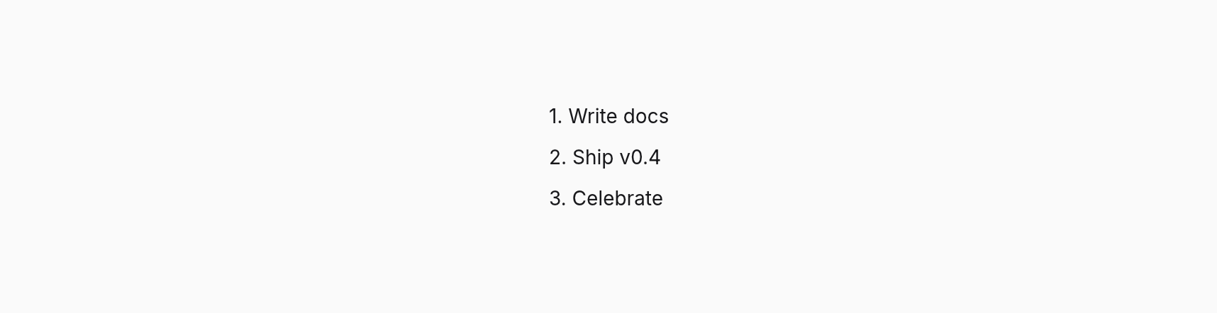
const tasks = ["Write docs", "Ship v0.4", "Celebrate"];

<List
  items={tasks}
  gap={8}
  keyForItem={(task) => task}
  renderItem={(task, index) => <Text>{index + 1}. {task}</Text>}
/>
Props
| Prop | Type | Default |
|---|---|---|
gap | number | 0 |
items | readonly T[] | — |
keyForItem | (item: T, index: number) => string | number | — |
renderItem | (item: T, index: number) => Child | — |
Inherited from ViewProps 13 props
| Prop | Type | Default |
|---|---|---|
align | Style["align"] | — |
autoFocus Focus this control when it first appears (HTML `autofocus`); interactive views only (Pressable). | boolean | — |
children | BindableChild | — |
dismissOnOutside A press outside the box fires `onOutsideClick` instead of reaching what is under it (light dismiss). Works on portals and in-flow boxes; an open portal wins. | boolean | — |
dragRegion | boolean | — |
flex CSS `flex`: `1` is `1 1 0`; strings take any CSS value, e.g. `"1 1 176px"`. | number | string | — |
focusable | boolean | — |
justify | Style["justify"] | — |
onOutsideClick With `dismissOnOutside`: a press (or right click) outside the box. | () => void | — |
padding | Style["padding"] | — |
portal | boolean | — |
style Values may be signals: setting one restyles this box without a render. | Reactive<Style> | — |
windowAction | "minimize" | "toggleMaximize" | "toggleFullscreen" | "close" | — |
Inherited from ScrollProps 5 props
| Prop | Type | Default |
|---|---|---|
followTail Stick to the end: while the area is at its end (or new), growing content keeps it there (a chat, a log). Scrolling away stops it; scrolling back to the end resumes it. | boolean | — |
onScroll | (offset: number, max: number, info: ScrollInfo) => void | — |
onScrollPosition | (position: ScrollPosition) => void | — |
orientation | ScrollOrientation | — |
speed | number | — |
Common props
Shared by every component. See descriptions →
classclassNamedropTargetfileDropTargethighlightidkeymotionFromonDragEnteronDragLeaveonDroponFileDragEnteronFileDragLeaveonFileDroponHighlightonPasteonPointerLeaveonPointerMoveonSizeonTransitionEndrovingGroupTypes
type BindableChild = Child | Signal<unknown> | BindableChild[];type Reactive<S> = { [K in keyof S]: S[K] | Signal<Exclude<S[K], undefined>> };interface ScrollInfo { source: ScrollSource }type ScrollOrientation = "vertical" | "horizontal" | "both";interface ScrollPosition { x: number; y: number; maxX: number; maxY: number; source: ScrollSource }